Thursday, October 27, 2011

9 The Basic Elements- Identity Logo Design

Dot >>>
In this logo for "Lullaby Studio," the dot is very active in its final design. Like 19th century Pointilist painters, the design uses dots to create the perception of colors. Dots of various sizes, tones, and colors are used in determining how to define the shape of a crescent moon. The dots are smallest along the edges of the moon. These particular dots connect and are therefore capable of leading the eye. The ability to lead our eyes is intensified by how close these dots are to one another.


Line >>>


In this logo and title for the website called "Vivid Ways," line is very much active in its final design. The graphically designed logo shows that it has been built on dots. The logo itself is a line with point positions and settings for tension and bias. It displays scalability as it has been manipulated to form two connected letters V and W- the initials for Vivid Ways. The connection of the V and W show the letters' relationship as the website's initials. The type fonts of the title "Vivid Ways" and the slogan "color-in your life" are defined and differentiated by the nature of their outlines- straight vs. curved, direct vs. complex, etc. The structure (proportions and relationships) of every letter in this design is based on lines.


Texture >>>


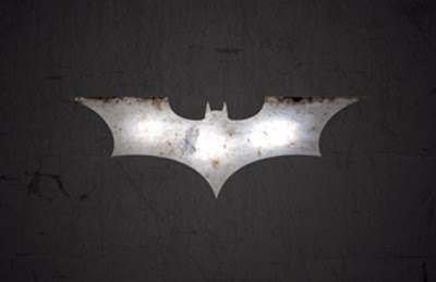
In this logo for the comic book franchise "Batman," texture is very much active in its final design.

Much detail is conveyed. All of its colored blotches have associations with materials. The simulated brown blotches create the illusion that the viewer is looking at rust. Also, the grey and white blotches together create the the illusion that the viewer is looking at a shiny metal object. Hence, this design relieves flatness and creates interest. Its textures have no tactile quality and only optical. It only appears as a rusted, shiny metal object. No one can reach out their hand and touch it to feel that it is an actual object.

Thursday, October 20, 2011

8 Visual Thinking Research

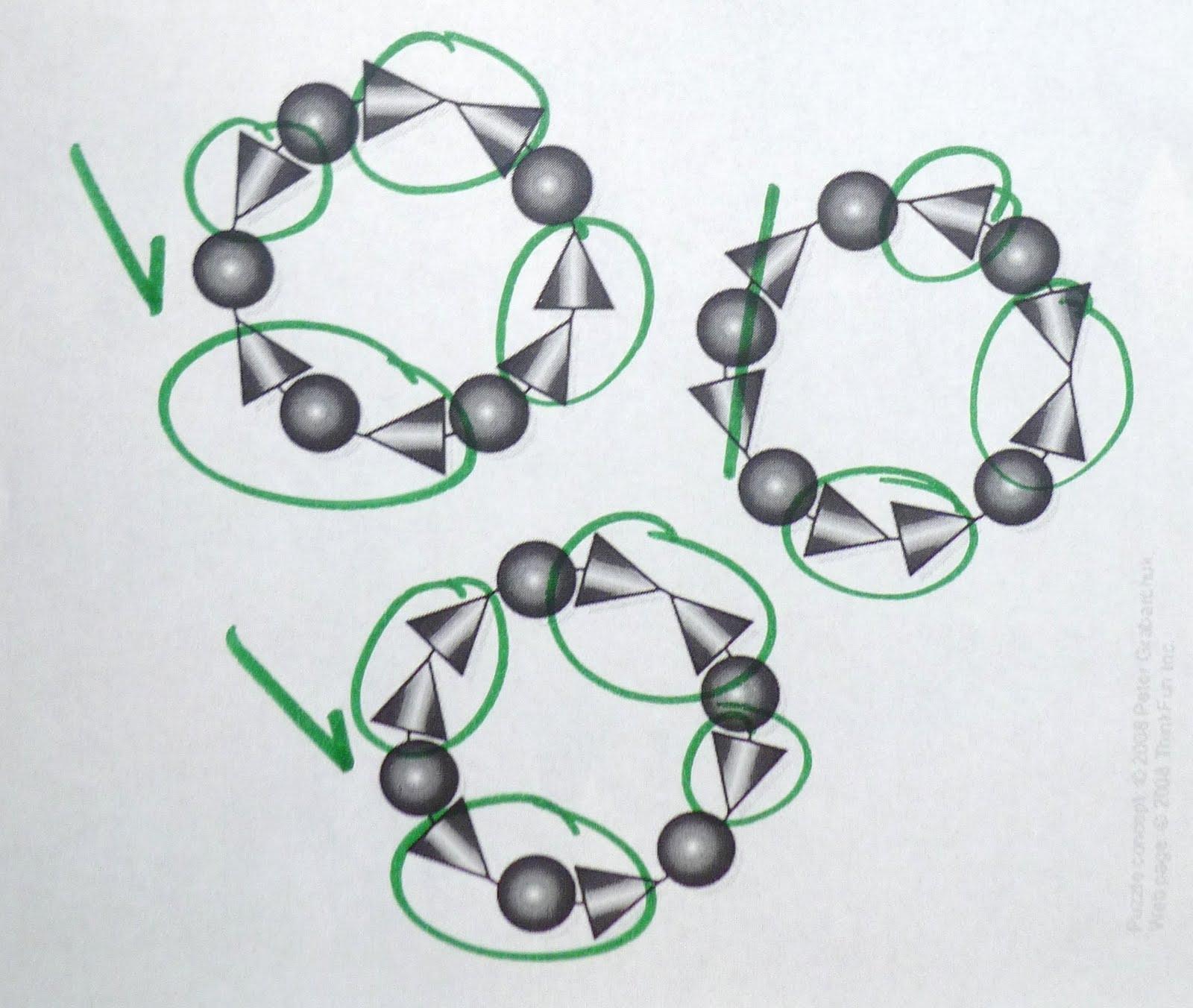
1) Which two bracelets are the same?

I used the pattern-seeking operation of matching to discover which two bracelets are identical. I particularly used the quick way of matching. I chose one random bracelet at at time, seeing each desired bracelet pattern as a whole. I attempted to match pairs without hesitation until I finally matched two.
My sister used the operation of matching as well. However, she used the long way in performing her matching. She compared details of one bracelet with the details of another. She even verbally talked to herself.


2) How many triangles are in the cat? (Answer: 20)


I used the pattern-seeking method of finding. I "closed" in on the figure, outlining the triangles that were most apparent to me from largest to smallest. I lastly counted the overlapping triangles.


My sister used the pattern-seeking method of finding as well. However, she "closed" a bit differently from my method. She immediately counted the most apparent triangles as well, but she counted the overlapping triangles at the same time.


Thursday, October 13, 2011

Visual Perception 2/ Feature Hierarchy

Mariah Carey: E=MC2, Island Def Jam Records

This poster is related to feature hierarchy in the way that it uses feature channels to create a visual design which promotes the uniqueness of singer Mariah Carey's album E=MC2. Color is used to pop out preattentively- especially the singer's name and human figure. Secondly, the viewer detects that shape has levels of variation. From the top down, words (the names) become smaller in size, allowing viewers to understand the importance of each phrase: 1) singer's name 2) album's name 3) lead single of the album 4) secondary singles. Together, these words operate by using scale to express how one set of words is more important than the next below or less important than the next up. The viewer next notices the motion created by the photo. From the bottom up, the image's depth creates the illusion that the person is standing over the viewer and that the viewer's perspective looks up at singer. Furthermore, the image's shape is detected due to how the white pops out within the black background. Combined, together, these three feature channels for a spatial layout. The viewer has the intuition that specific parts of the poster have specific roles to guide them in acquiring information rapidly and efficiently.

Thursday, October 6, 2011

Visual Perception 1 / Top-Down Visual Processing


Lady Gaga: Born This Way advertisment by Interscope Records


image from http://www.nycitsalwaysanadventure.wordpress.com/


The cognitive goal of this advertisement is to grab viewer's attention with the image of Lady Gaga's extremely large, pale face which has covered the entrance side of a subway building. In being so massive, bold, and out of the ordinary, viewers' eyes are bound to be drawn to the ad. The ad is designed to send a message. Hence the neurons in their eyes will send visual information to their brains as they scan the ad. The viewer immediately makes short fixations to get an overview of the ad, starting from eye level and up to the top of the ad. The viewer then scans from left to right, reading the musician's name, the name of the record, and the album's release date; these are the goal-directed eye movements the viewer makes to try and understand the design's message, which is to promote Lady Gaga's upcoming album. The words on the ad are very small compared to Lady Gaga's photograph. Hence the viewer soon makes longer fixations and makes scan paths below the ad's title and on the photograph. Their eyes will be strongly bias over Lady Gaga's enormous face.

Thursday, September 29, 2011

Design Success and Failure in Relation to Syntactical Guidelines

This traffic sign clearly denotes that a particular lane is only for bicyclists. The sign is divided in to two sections, and in each section, the words and symbols play the positive roles as the backgrounds play the negative roles. The viewer sees the words and symbols before the backgrounds. The entire sign is balanced on a vertical axis with horizontal factors. The sign guides the viewer's eyes in a downward direction down the center, reading "Right lane, bicyclists only." The bike symbolizes bicyclists. Furthermore, the sign is designed in a leveled rectangular shape. The diamond symbol next to the phrase "right lane" draws the viewer's eyes from left to right; the phrase "right lane" is grouped on the right-hand side, denoting the "right lane." Also, the phrase is balanced with the same visual weight and stability as the diamond symbol.


Reading the words on this sign, the viewer would think that the design of this traffic sign is intended to caution drivers that cyclists are merging from the left-hand side of drivers' vehicles (based on the lower part of the sign). However, at the same time, the upper part of this sign (with the image) denotes an entirely different message. The word state that there is a street ahead that cyclists are entering from the left, but there is an excess of grouping with symbols. The arrows symbolize the lanes for the vehiclists, and the bike symbolizes the bicyclists. But the image depicts a bike lane running in between two car lanes. Furthermore, the grouping of their positions is unresolved by an unclear state of difference. The lanes are depicted to be just right off the center of the street. Hence the sign is completely ambiguous and benefits neither from leveling nor sharpening.

Thursday, September 22, 2011

Visual vs Symbolic Language


Representations:
Recognizable employment ads from newspapers (in background).
Bright light from a lamp.

Abstractions:
Recognizable figures of people without detailed persons' features.
Line of people is composed of 2 duplications of the same people.
Light shining through darkness

Symbols:
Line of people.
Typeface of the word "unemployment" is bold and strong, signifying the high rate of unemployment.
Black color of people.

First off, the typeface of the word "unemployment" is bold and strong, signifying the high and dramatic rate of unemployment in the economy. The line of people is composed of 2 duplications of the same people, signifying that the same people are losing job after job and keep waiting and searching for new jobs. They are answering to employment opportunities (such as the ads in the background), waiting and attempting "multiple times" to find work. The people are colored black, symbolizing their dark sadness/depression from unemployment. The black figures are positioned in front of the bright ad background, appearing as silhouettes. There is a light shining through the shadows of the background, bringing the ads into brighter view. Perhaps there are shadows because these unemployed people stay up late at night looking for jobs in the newspaper, turning on lights to read the ads. The scale of of the ads are enormous compared to the people, symbolizing that unemployment is taking over these people's lives. It's a force they cannot avoid; they have no choice but to look for jobs. The word "unemployment" is written in bold, black capital letters and positioned towards the top of the image and directly above the figures; this bold appearance of this word labels the people, and with the white rectangle behind the letters, the word appears as a representational sticker label abstracted to symbolize a denotative label for the jobless figures.

Thursday, September 15, 2011

Meaning 2: Interactions Between 3 Levels


Advertisement for the Fragrance Series *Lollipop Bling* by Mariah Carey


Representational

As this fragrance series "Lollipop Bling" is by singer Mariah Carey, her representational photo is used as a centerpiece for the advertisement. This photo of her is specially used for the ad as she wears shiny, sparkling "bling." The word bling is a slang term used for sparkling, fancy jewelry. For the viewer, this full and natural colored photo of Carey is the closest thing to actually seeing the singer in direct experience.

Photos of the three fragrance bottles are shown as well. The viewer recognizes the butterfly shape of the bottle caps. However, the general appearance of a butterfly has been abstracted down to its understructure without the details of a representational butterfly. These representational photos of the perfume bottles hold the general and universal shape of a butterfly. Representational butterflies have been translated into the design of bottle caps for functional purposes.

Particularly with the clouds' proportions (scaling from largest to smallest), the viewer recognizes the perspective of clouds in a blue sky.

This advertisement shows a combination of representational photos, symbols, and abstract elements. Put together, they very much overlap, and the viewer perceives and understands the this design is an image of a fantastical dreamland like an illustration the viewer may have experienced from a fairy tale book.


Abstract


The background of the ad is not very detailed. Although the viewer recognizes a butterflies, clouds, lollipops, and sunlight shining through a sky, these features are very structural. The elements are direct and emotional, evoking feelings of bliss especially with the bright colors and outward directions. Carey is the large, representational centerpiece in the composition of this image. The abstract elements around her create impact the viewer's mind, presenting a blissful, fantastical dreamland.


In particular to the largest cloud, there is a concept that expresses softness and comfort. Carey appears to comfortably sit on this cloud just as if she were sitting on a real pillow. This communicates that the representation of a cloud has been abstracted into a soft, comfy pillow. Furthermore, in all the other clouds floating around Carey (sitting atop the largest cloud), the viewer envisions and experiences abstraction toward symbolism of feeling as "light as a cloud." Similarly, the white outlined butterflies and multi-colored bubbles are abstractions used to express yet signify the feeling of lightly floating on air as well.


Symbolic

As stated before, the word "bling" is a slang term used as a synonym for flashy, fancy jewelry. In the ad, Mariah Carey is wearing actual bling (a diamond butterfly ring) and "lollipop bling" (a ring-shaped lollipops) on her fingers to denote the theme behind the fragrance series. Particularly for these symbols, the viewer would need to know some special information about Carey to understand what they signify: Carey has always had a sweet tooth, so knowing she likes candy, her husband had proposed to her by hiding her diamond engagement ring inside a ring lollipop candy wrapper and letting her open it for a very "sweet" surprise. Hence the perfumes are inspired by the flavors of ring pops to symbolize the "sweet" love Carey felt when her husband proposed to her.

Some of the lollipops in the ad are mainly representational, but the lollipops covered with circular diamonds are representations that have been transformed as abstract visual data. This is an advertisement for selling perfumes not lollipops. Interestingly, the connotative appearance of these bejeweled lollipops denote the sentimental meaning of "lollipop bling." In the image, the three of the bejeweled lollipops are exaggerated in size and float right behind the perfume bottles thus perhaps signifying sweetness itself. Hence, the viewer appreciates these lollipops for their symbolic and abstract natures.

Simultaneously, the abstract rays of sunlight pierce outward through the sky in multiple directions. The bubbles, butterflies, and smallest lollipops are positioned in the same directions as the rays, creating a visual spark which perhaps denotes that the fragrances have a burst of sweetness that is as powerful as a burst of sunshine.