 In this logo for "Lullaby Studio," the dot is very active in its final design. Like 19th century Pointilist painters, the design uses dots to create the perception of colors. Dots of various sizes, tones, and colors are used in determining how to define the shape of a crescent moon. The dots are smallest along the edges of the moon. These particular dots connect and are therefore capable of leading the eye. The ability to lead our eyes is intensified by how close these dots are to one another.
Line >>>
In this logo and title for the website called "Vivid Ways," line is very much active in its final design. The graphically designed logo shows that it has been built on dots. The logo itself is a line with point positions and settings for tension and bias. It displays scalability as it has been manipulated to form two connected letters V and W- the initials for Vivid Ways. The connection of the V and W show the letters' relationship as the website's initials. The type fonts of the title "Vivid Ways" and the slogan "color-in your life" are defined and differentiated by the nature of their outlines- straight vs. curved, direct vs. complex, etc. The structure (proportions and relationships) of every letter in this design is based on lines.
Texture >>>
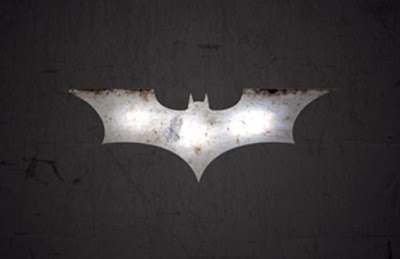
 In this logo for the comic book franchise "Batman," texture is very much active in its final design.
 In this logo for the comic book franchise "Batman," texture is very much active in its final design.
Much detail is conveyed. All of its colored blotches have associations with materials. The simulated brown blotches create the illusion that the viewer is looking at rust. Also, the grey and white blotches together create the the illusion that the viewer is looking at a shiny metal object. Hence, this design relieves flatness and creates interest. Its textures have no tactile quality and only optical. It only appears as a rusted, shiny metal object. No one can reach out their hand and touch it to feel that it is an actual object.

No comments:
Post a Comment