Thursday, December 8, 2011

14 Visual Techniques

Design Example #1:
Finding Nemo logo

Visual Techniques:

Balance <-> Instability

Activeness <-> Stasis

Consistency <-> Variation

Singularity <-> Juxtaposition


Design Example #2:
A Bug's Life logo


Visual Techniques:

Balance <-> Instability

Depth <-> Flatness

Consistency <-> Variation

Singularity <-> Juxtaposition


These two design works (Pixar movie logos) have similar and different result(s) between their combinations of techniques. Both designs present balance vs. instability: They achieve balance in the way that there is a center of suspension midway between two weights-as in the two sides of each design. However, each design must use uneven shapes of instability to express the unique themes of the movies. Both logos show consistency vs. variation in the way that each composition is dominated by one thematic approach but offers diversity and assortment at the same time. Whether solely bug or aquatic-themed, each design uses a number of typefaces to express its theme. Both designs present Singularity vs. Juxtaposition: They each express singularity by focusing on one separate and solitary theme (aquatics or bugs). However, within each design, juxtaposition is shown as letters conformed with animals and ordinary letters are positioned side by side, influencing the viewer to compare the relationships of the cues. Furthermore, the "Finding Nemo" logo expresses activeness vs. stasis, while the "Bug's Life" logo expresses depth vs. flatness. The "Finding Nemo" logo presents activeness with an abstract wave, and the design simultaneously presents stasis with upright letters. Thus there is an illusion that the wave is moving in curved motions along the letters. The "Bug's Life" logo presents depth with a three-dimensional leaf with various tones to define its shape, and the design simultaneously presents flatness with two-dimensional letters.

Thursday, December 1, 2011

13 CONTRAST

This advertisement clearly demonstrates an effective use of contrast contributing to a successful design. Through a strategy of surrealistm, the head of a lion and the body of man have been placed into juxtaposition. A lion's head has been placed on a man's body. This escapes the confines of conventional thinking. In the real world, a lion's head is attached to a lion's body, and a man's head is attached to a man's body. This advertisement emphasizes the critical and imaginative powers of the subconscious. This image influences the viewer to think new, unpredictable thoughts- that a lion's head can really be attached to a man's body. It achieves the designer's creativity and expression beyond conventional modes. Our knowledge of human and animal bodies has been challenged.


This logo for Mears Ghyll Bridal Rooms clearly demonstrates a poor use of contrast contributing to a failed design. The use of contrast in tone is ambiguous. The letters are barely visible or readable. The viewer needs to squint and look very closely in order to see the words. The grey tone of the background is too close to the white of the letters. Hence the message of the logo is not understandable. Also, because the phrase "Bridal Rooms" is a very small scale, these two words are especially unseeable. It has a neither-here-nor-there-ness. All of the words in the logo are close to disappearing.

Thursday, November 17, 2011

12 Movement / Motion

IMPLIED MOTION IN DESIGN


This logo for "Disney Magic Music Days" very much is designed to imply motion. The design shows a few bars of music with a large treble clef note at the beginning lefthand end of the bars (lines)- just like how actual music is shown in music books. However, in this logo, the bars are curving and converging to the righthand side, while actual music bars are completely straight and parallel. In this logo, the converging of the bars represent the Gestalt Law of Continuation, so we expect the patterns and lines to continue. In this case, we expect the music bars to continue as they converge into the implied distance. Hence they imply movement and change. The letters of the phrase "Magic Music Days" are spread across the music bars and have variations in scale, becoming smaller as the bars converge. As the viewer reads the shrinking letters, this implies a forward movement, leading the viewer's eyes through the composition. The word "magic" is largest in scale as it is implied to be closest in depth. The stars are dispersed along the logo to convey the energy of the music bars' movement; hence the stars are visible multiples that appear because of the music bars' implied fast movement.


This logo for Disney and Pixar's film "Up" very much is designed to imply motion. The floating house and balloons are positioned diagonally as if moving through midair. Based on our prior experience of the world, we interpret the house and balloons to be in the process of floating upward. It seems as if the house and balloons are frozen in motion. The large, slanted letters of the word "up" lead the viewers' eyes through the composition. Their straightly edged shapes are composed of diagonal lines. Also, there is a variation of scale in the word. The letters "U" and "P" are each a different scale. The word "up" itself is positioned diagonally, creating the illusion of forward movement in the viewer's perception. The diagonal stress and variations in scale in the logo all communicate movement and change.

Thursday, November 10, 2011

11 Dimension / Depth / Space / Scale

This is the album cover of Mariah Carey's album "Merry Christmas II You." The design illustrates a three-dimensional scene in linear perspective. The viewer envisions actual space hence actual objects. The viewers' size perception of the objects depends on the context of the design. The image presents accurate scale with closer objects (such as the snow and human figure) appearing larger and farther objects (such as the stars and blue houses) appearing smaller. The viewer recognizes familiar and relative size. The lines on the brick walls create a texture gradient. The brick wall on the lefthand side particulary positioned at an angle in our perspective. Hence one end of the wall grows larger, stretching outward from the image as the other end grows smaller, stretching inward into the image. (The snow has no texture gradient, so its depth is ambiguous.) Throughout the design, objects overlap each other. Hence the viewer can understand what objects's positions such as: The human figure and snowman are in front of part of the brick wall; the brick walls are in front of the houses; the clouds are in front of the sky and stars.

Thursday, November 3, 2011

10 Tone and Color


TONE


A) Tone very much operates in this advertisement promoting singer Lady Gaga and her song "Hair." Tonal range is the key to defining the photograph- especially Lady Gaga's appearance. The details of her face, body, and clothes are communicated and distinguished by high dynamic and tonal range. Also, the entire photograph shows peak whites (such as background and some of the letters), absolute blacks (the clothing and edges of the ad), and lots of tonal information (grey scales) in between.

B) Tone interacts with the visual design element of dimension. Almost the entire advertisement is a grey-scale photograph. Its blacks, whites, and greys define the three-dimensional structures (mainly Lady Gaga's figure), shadows, and lighting. Hence, with just the advertisements' tonal range, viewers' eyes are able to recognize and understand the image as we, as humans, are evolved to see a three-dimensional world.


COLOR


A) Color very much operates in this advertisement promoting singer Lady Gaga and her song "Hair." The two colored areas of the design are Lady Gaga's hair and the song's title "Hair." Hence, since the song is about hair, the singer's hair and the song title are the same color. Because these two areas are relatively small parts of the design, they create a pop-out effect within the dominantly grey-scale advertisement.

B) Color interacts with the visual design element of texture. Particularly for Lady Gaga's hair, color is used to show the values within the three-dimensional image of the singer's hair. With a color value scale ranging from light to dark, viewers are able to analyze the structure of the hair- in areas where it is more clustered or dispersed.

Thursday, October 27, 2011

9 The Basic Elements- Identity Logo Design

Dot >>>
In this logo for "Lullaby Studio," the dot is very active in its final design. Like 19th century Pointilist painters, the design uses dots to create the perception of colors. Dots of various sizes, tones, and colors are used in determining how to define the shape of a crescent moon. The dots are smallest along the edges of the moon. These particular dots connect and are therefore capable of leading the eye. The ability to lead our eyes is intensified by how close these dots are to one another.


Line >>>


In this logo and title for the website called "Vivid Ways," line is very much active in its final design. The graphically designed logo shows that it has been built on dots. The logo itself is a line with point positions and settings for tension and bias. It displays scalability as it has been manipulated to form two connected letters V and W- the initials for Vivid Ways. The connection of the V and W show the letters' relationship as the website's initials. The type fonts of the title "Vivid Ways" and the slogan "color-in your life" are defined and differentiated by the nature of their outlines- straight vs. curved, direct vs. complex, etc. The structure (proportions and relationships) of every letter in this design is based on lines.


Texture >>>


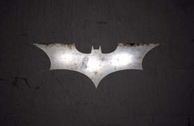
In this logo for the comic book franchise "Batman," texture is very much active in its final design.


Much detail is conveyed. All of its colored blotches have associations with materials. The simulated brown blotches create the illusion that the viewer is looking at rust. Also, the grey and white blotches together create the the illusion that the viewer is looking at a shiny metal object. Hence, this design relieves flatness and creates interest. Its textures have no tactile quality and only optical. It only appears as a rusted, shiny metal object. No one can reach out their hand and touch it to feel that it is an actual object.

Thursday, October 20, 2011

8 Visual Thinking Research

1) Which two bracelets are the same?

I used the pattern-seeking operation of matching to discover which two bracelets are identical. I particularly used the quick way of matching. I chose one random bracelet at at time, seeing each desired bracelet pattern as a whole. I attempted to match pairs without hesitation until I finally matched two.
My sister used the operation of matching as well. However, she used the long way in performing her matching. She compared details of one bracelet with the details of another. She even verbally talked to herself.


2) How many triangles are in the cat? (Answer: 20)


I used the pattern-seeking method of finding. I "closed" in on the figure, outlining the triangles that were most apparent to me from largest to smallest. I lastly counted the overlapping triangles.


My sister used the pattern-seeking method of finding as well. However, she "closed" a bit differently from my method. She immediately counted the most apparent triangles as well, but she counted the overlapping triangles at the same time.